
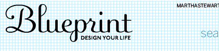
Blueprint Magazine: Typefaces
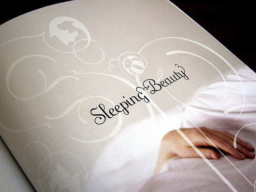
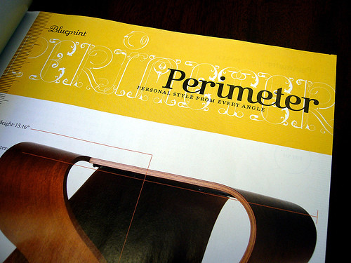
Like me, I'm sure most of you are eagerly awaiting the next issue of Blueprint magazine, due to release in a few short (ahem!) months. When I first flipped through the premiere, I was intriqued and even excited on some levels, divided on many others, but one strong feature made it stand out to me, the swirly ornate typefaces. I read reviews on various websites and blogs, some called them "cluttered", "fillers to make up for lack of content", and "unimaginative". I'm willing to stand up in defense of Blueprint, I think the swirly curly type made the issue.
As someone majorly drawn to cursive handwriting, I sing in praise of the various types found in Blueprint and feel as though the real charm of the magazine centered around them. Afterall, like a design blog, a good design magazine should be beautiful, right?
No matter how many magazines, blogs, or popular stores try to sway me, I'm not buying into the lifestyle promoting only clean modern design. Yes, I enjoy it on many levels, and pepper my home with nooks that are very clean and quite modern. I'm even an avid reader of Dwell and Architectural Digest. But, despite the attraction, I can't fully commit to pure modern design because I rather fancy my random piles of projects on my desk and the jars of stamps and buttons and spools that I collect on my shelf. I couldn't live without a fresh stack of dog-earred magazines positioned on the floor, waiting to be held and loved. My antique linens, porcelin vases from Germany, and porcelin teacups given to me by my husband mean so much. My home is not a DWR showroom and I'm certainly not a minimalist. I'm not even 100% sold on mid-century modern design either, although I do enjoy many parts of it. On the flip side, a home that is completely decked out in traditional, french farmhouse, shabby chic, or packed to the rim with clutter or loaded with lace and antiques would make me jump in my car and drive off the end of the earth. Where does this leave a girl?
I guess if I have to categorize, I am a lover of Vintage Modern. Not the Target line by Thomas O'Brien, but the combination of old meets new. And much like the design I enjoy in my home, you'll also find it in my wardrobe, combining modern low rise jeans with vintage-inspired blouses and velvet blazers with satin piping. To take this even further, I've figured out that this is exactly why the Blueprint typeface captivated me on so many levels. It's clean, classic yet modern, feminine, old-fashioned, and charming - all rolled into one. Not so clean that it lacked character. Not so curly that words were illegible. It was just right.
If you're a graphic designer, you'll really appreciate this. Sure, I did way more research on Blueprint typefaces than I needed to, but here's what I unearthed. Fans of typography rejoice and read In Use: Flight For Blueprint Magazine, a short but sweet article written by the folks over at Font Shop dishing about the typefaces used in Blueprint along with photos, descriptions, and links for purchasing them (fling, falstaff, filosofia, kursivschrift (which has its roots in German mapmaking), and the gorgeously lavish missionary font).
Did all of this make you think a little about typefaces and have you given much thought to which ones lure you in? If so, good... It's always enlightening to have an aha! moment. Honestly, until Blueprint hit the stands, I had never really thought much about this subject, but now that I have, it's fascinating to see how closely it relates to my overall design aesthetic.
Your thoughts?
(images from the font shop)