
Color Theory 101
Whether orange (a secondary color) has you at hello, or doesn't quite attract your attention, you can't deny the strength it has when correctly used in an room. I thought it would be fun to pull some of the pages from my color relationship notebook from a color theory class I completed a few years ago to show you a few examples of color relationships when orange is involved.
 Here's a modified triad. You are mixing various tints and tones on the color wheel in yellow-green, yellow-orange, and red-orange.
 This is a complementary color scheme in orange and blue. Blue calms the intensity of orange, so there's a nice balance here.
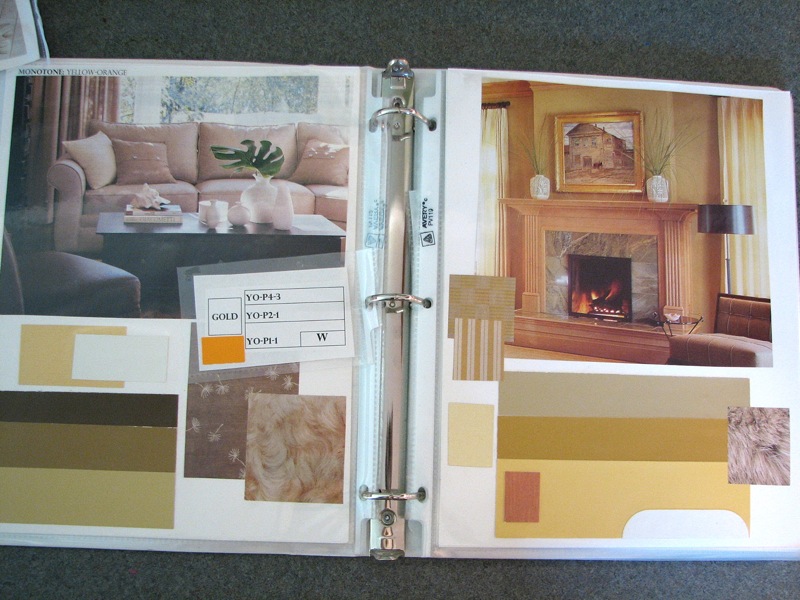 And this is what you'd call monotone in yellow-orange. Notice how muted and soft orange can become?
Isn't it fascinating to see the color wheel in action? I highly suggest purchasing one (they're around $3 at any craft or art supply store), and either taking a color theory class at your local college, or find something reliable online where you can learn the basic principles. I prefer the classroom experience myself, as you are able to receive honest critiques, which I find are essential to growth, at least for me. Plus, color theory class is more than creating binders and clipping from magazines. You have to do a lot of painting, sometimes with tears because the process can be strenuous, but in the end, 100% worth it. Here's a little color theory intro to get you started...
(images from Holly Becker for decor8)